Frank Owen Gehry
Study And Initial Phase Of Life
Frank O. Gehry was born on February 28, 1929. He grew up in Toronto (Canada) and in 1947 moved his family to Los Angeles.
Obtaining his university degree in Architecture from the University of South California in1954 he then studied City Planning at the Graduate School of Design of the University of Harvard.
He continued his career as an architect over the next four decades, working on private and public buildings in America, Europe and Asia.

In 1962, Frank Gehry founded his own firm, and embarked on the design of a large variety of residential [Hillcrest Apartments (1962), Bixby Green (1969)], commercial [Kay Jewelers Stores (1963-1965), Joseph Magnin Stores (1968)], office [Rouse Company Headquarters (1974)], and institutional projects. He is the Director of Design of the firm Frank O. Gehry and Associates, Inc. (1962).
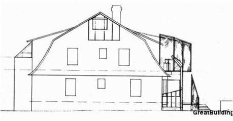
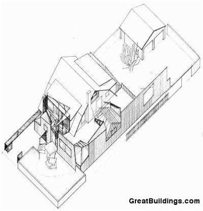
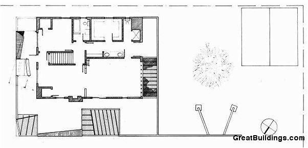
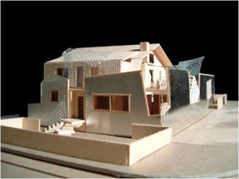
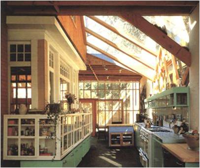
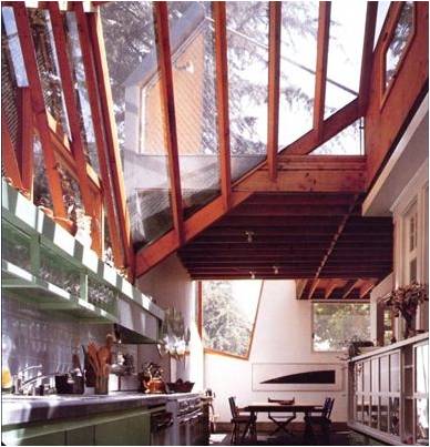
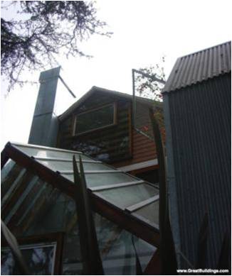
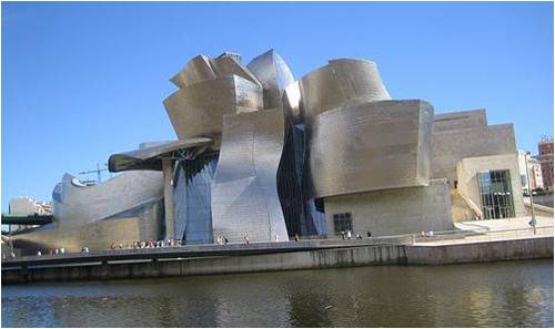
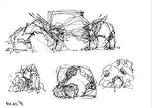
- Perspectively distorted shapes
- Sculptural masses molded by light
- Buildings that reveal their structures
- Use of mass produced and affordable materials
- Exposing wood frame construction
- Using plywood, corrugated metal, and chain link metal fence as sheathing or screens
- Breaking volumes Into incomplete geometries and partial object
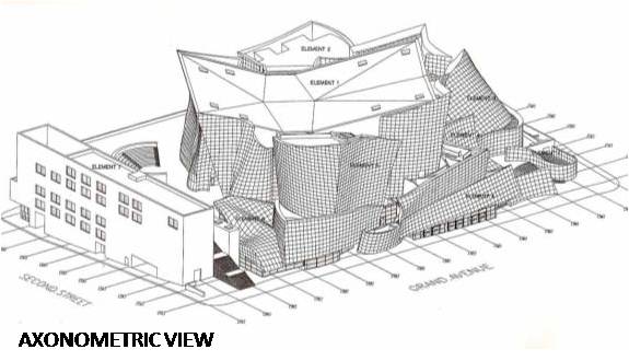
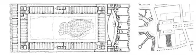
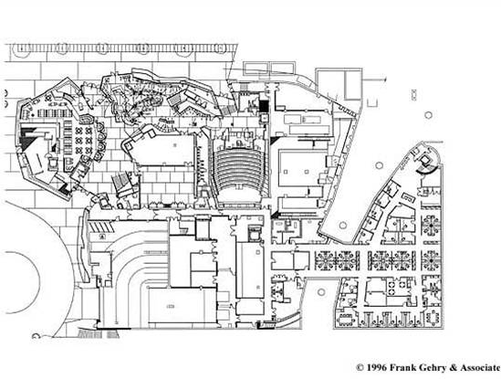
- 10500sqm galleries
- 25000 sqm public space
- 50m high atrium
- An auditorium
- Restaurant and cafe.
- an open and accessible main entrance
- a sympathetic and inclusive attitude in the building’s relationship to the Music Center’s existing Dorothy Chandler Pavilion
- a pedestrian scale frontage along Grand Avenue
- a generous and open backstage area
- a large garden.
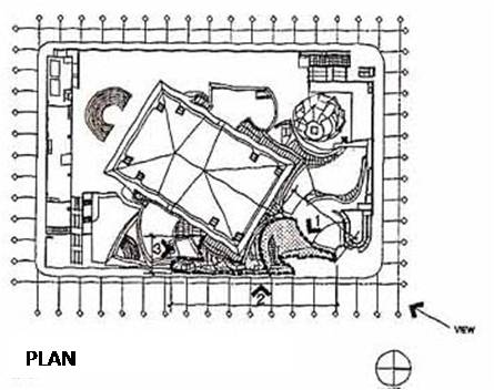
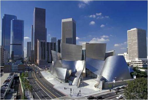
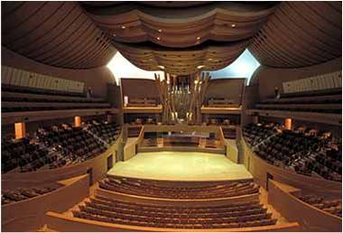
- The concert hall lobby is accessible from the street.
- Large operable glass panels provide maximum accessibily to various amenities including a gift shop, restaurant and café, an underground parking garage and a pre-concert performance space.
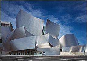
- The focus of the design is the 2265-seat main concert hall whose interior and form are an expression of acoustical parameters. Seating surrounds the orchestra platform. The wood walls and the sail like wooden ceiling forms give one the impression of being within a great ship inside the walls of the hall.
- Skylights and a large window at the rear of the hall allow natural light to enhance daytime concerts.
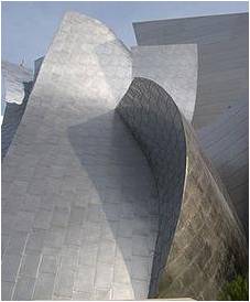
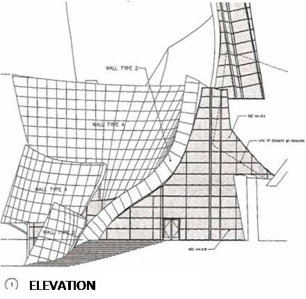
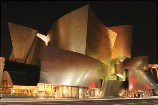
- The exterior of the concert hall is clad in stainless steel panels. The building’s orientation, combined with the curving and folding exterior walls, presents highly sculptural compositions.
- A six level, 2500 car garage is located below grade with access from thee surrounding streets.
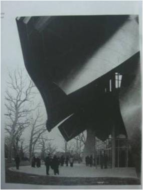
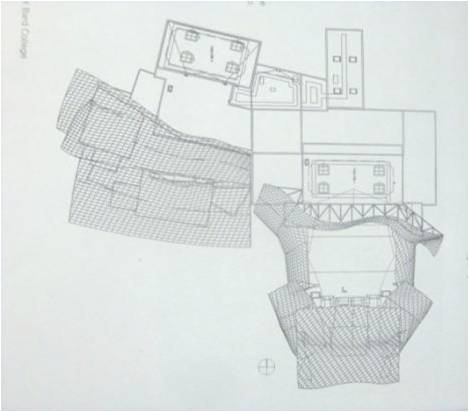
DZ Bank Building, Central Berlin
- Client: DG Immobilien Management GmbH
- Area: 20,000 square meters
- Begin Design: 1995
- Begin Construction: 1996
- Completion: July 2001
- Functions: offices; conference space; residential building
- Key feature: organic form within the atrium (conference facility)
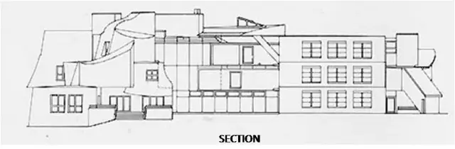
Both the Pariser Platz facade and the Behrenstrasse facade are fairly rectilinear due to strict limitations FOGA had to follow. The facades, clad in a buff-colored limestone that matches the Brandenburg Gate, are scaled independently from one another, so that the proportions of both are appropriate to the immediate urban area within which they each exist.
The Pariser Platz facade features a series of simple, punched openings and deeply-recessed window bays, allowing the building to blend naturally into the unique urban fabric which is the setting of the Brandenburg Gate. A glass canopy covers the main entry from Pariser Platz.
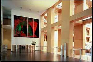
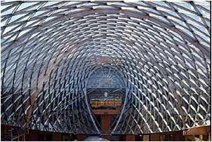
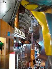
The high-volume foyer immediately inside the main entry offers a view into the building’s large interior atrium, which features a curving glass ceiling and a curving glass floor.
A wood-clad arcade leads to the office elevator lobbies, which are located on either side of the atrium. Offices and conference spaces are organized around the atrium, and are oriented inward to take advantage of the natural light that floods through the glass ceiling.
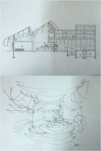
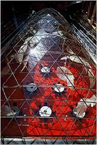
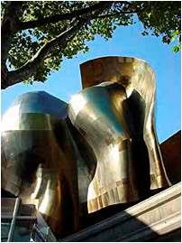
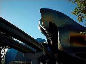
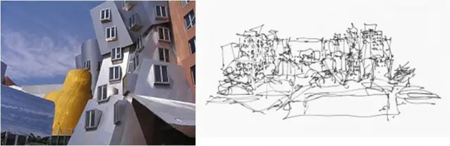
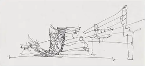
The building’s primary conference hall is located within a highly sculptural shell that rests on the glass floor in the center of the atrium making it appear to float in the space. The four-story high structure, its curvy form resembling an enormous prehistoric horseâs head, is clad in stainless steel on the exterior and wood on the interior.
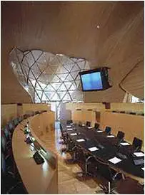
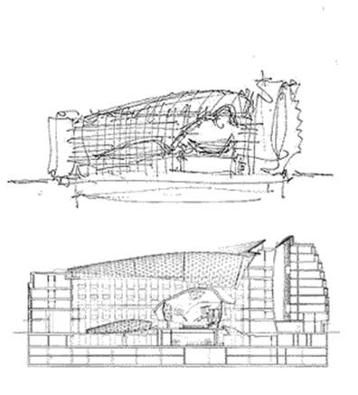
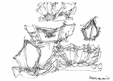
The beginning of the form for the Conference Room grew out of the Peter Lewis House; a 6 year project that was never realized. From 1989 to 1995, when he worked intensively on the Lewis House, Gehry used the project to experiment with free-form shapes that since have shown up in many of his most famous buildings. The room was actually booked for future conferences long before it was constructed…just from the model.
A Sky Lounge is located on the roof of the building, beneath a stainless steel collar that surrounds the Southern end of the atrium’s glass ceiling. The Sky Lounge features high ceilings and expansive glazing designed to take advantage of the building’s spectacular views of the Brandenburg Gate, the Reichstag, and the Tiergarden.
A second, smaller interior atrium will serve the residential component of the project. This atrium promotes ventilation in the residential area and allows natural light to enter both sides of each apartment.
A reflecting pool at the bottom of the atrium adds a dynamic quality to the light, best seen from the glass elevators that service the residential area.
- innovative storm water retention and management system that employs biofiltration and which services several of the surrounding buildings as well as the Stata Center.
- irrigation system connected to central weather station—system uses weather data to control water flow, identify leaks, and cut off water flow
- light pollution reduction
- extensive use of displacement ventilation utilizing a raised floor system
- monitoring and controlling CO levels in garage through a demand controlled ventilation system
- minimizing refrigerants and eliminating Halon, a fire retardant, in the building
- operable windows for natural ventilation and individual control, and which provide an abundant use of daylight in all interior spaces
- landscape design for Northeast Sector that uses native vegetation and water-efficient design
- roof design that incorporates landscaping for shading and storm water retention and a white reflective surface to reduce heat island effect
- construction waste management plan by contractor to recycle construction waste, which, for example, achieved a near 100 percent recycling rate for the demolition of the garage
- recycled timbers from Building 20 for flooring
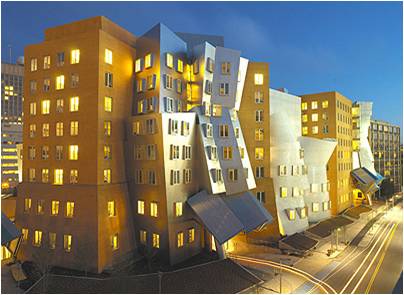
DESIGN FEATURES:
- 67,000 m2 academic complex
- flexible research facilities
- classrooms
- large auditorium
- social areas along the interior “student street”
- fitness facilities
- childcare center
CRITICISM:
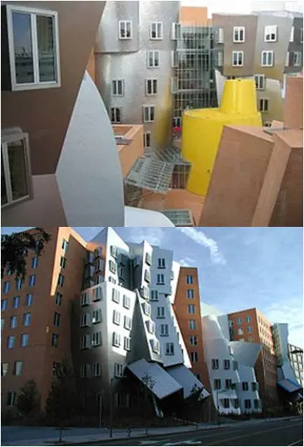
According to Boston Globe architecture columnist Robert Campbell, “the Stata is always going to look unfinished. It also looks as if it’s about to collapse. Columns tilt at scary angles. Walls teeter, swerve, and collide in random curves and angles. Materials change wherever you look: brick, mirror-surface steel, brushed aluminum, brightly colored paint, corrugated metal. Everything looks improvised, as if thrown up at the last moment. That’s the point. The Stata’s appearance is a metaphor for the freedom, daring, and creativity of the research that’s supposed to occur inside it.“ He praised Gehry for “break[ing] up the monotony of a street of concrete buildings” and being “a building like no other building.“
There are certainly many who are less enamored of the structure:
- The use of glass for walls on the inside means that those who work in the building have to give up a sense of privacy.
- There is also one lecture room where, because of the slight lean of the wall panels, some people have been known to experience vertigo.
- Sound insulation is almost absent.
- The building has also been criticized as insensitive to the needs of its inhabitants, poorly designed for day-to-day use, and at an official cost $283.5 million, overpriced.
Probably one of the more successful aspects of the building is the inner circulation system with niches for impromptu meetings and blackboards along the wall.
Former Boston University president John Silber said the building “really is a disaster.”
In 2007, MIT sued architect Frank Gehry and the construction companies, for “providing deficient design services and drawings” which caused leaks to spring, masonry to crack, mold to grow, drainage to back up, and falling ice and debris to block emergency exits.


- The buildings waste structural resources by creating functionless forms.
- The buildings are apparently designed without accounting for the local climate.
- The spectacle of a building often overwhelms its intended use, especially in the case of museums and arenas.
- The buildings do not seem to belong in their surroundings.
- The buildings are often unfriendly towards disabled people. The Art Gallery of Ontario, for example, had most ramps removed at Gehry’s behest.
- Complex and innovative designs like Gehry’s typically go over budget.
- Some have even described Gehry as a “one-trick pony” and an “auto-plagiarist”, referring to the similarity in style some of his buildings share.
- MIT sued Frank Gehry’s architecture firm claiming design and construction failures in its Stata Center which has developed cracks, leaks and other problems
The Inhabitable Fish


 in which Frank Gehry not just designs a single abstracted fish, but a school of them")

Gehry is very much inspired by fish. Not only do they appear in his buildings, he created a line of jewelry, household items, and sculptures based on this motif.
Standing Glass Fish is just one of many works featuring fish which Gehry has created. The gigantic fish is made of glass plates and silicone, with the internal supporting structure of wood and steel clearly visible. It soars above a reflecting pool in a glass building built especially for it, in the Minneapolis Sculpture Garden.
Another huge Gehry fish sculpture dominates a public garden in front of the Fishdance Restaurant in Kobe, Japan.
Other Design Works- Furniture Etc
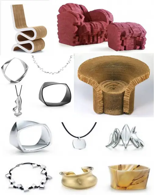
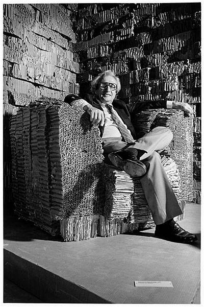
In addition to architecture, Gehry has made a line of furniture, jewelry, various household items, sculptures, and even a glass bottle for Wyborowa Vodka. His first line of furniture, produced from 1969–1973, was called “Easy Edges”, constructed out of cardboard. Another line of furniture released in the spring of 1992 is “Bentwood Furniture”. Each piece is named after a different hockey term. He was first introduced to making furniture in 1954 while serving in the U.S. Army, where he designed furniture for the enlisted soldiers. The success of the first line led to the production of the more free-form “Experimental Edges” of 1979 and continues with current prototypes for a new series of chairs. In 1983, Frank Gehry produced a limited edition of lamps in die form of fish and snakes made out of Colorcore Formica.
Awards
1977: Arnold W. Brunner Memorial Prize in Architecture from the American Academy of Arts and Letters.
1989: Pritzker Architecture Prize, perhaps the highest recognition in this field, to honour his “important contributions to humanity and to construction through architecture.”
1992: Wolf Prize in Art (Architecture from the Wolf Foundation. The same year he received the Praemium Imperiale Award from the Association of Arts of Japan to “honour the great contributions to the development, popularisation and progress of the arts”.
1994: First winner of the Dorothy and Lillian Gish Award for his lifetime contribution to the arts.”
1998: National Medal of Arts and first winner of the Friedrich Kiesler Prize.
1999: Lotos Medal of Merit of the Lotos Club and the Gold Medal of the American Institute of Architects.
2000: The Lifetime Achievement Award from the Cooper-Hewitt National Design Museum
2004: Woodrow Wilson Award for public service by the Woodrow Wilson Center of the Smithsonian Institution in New York City.
2006: Americans for the Arts have awarded him the Lifetime Achievement award.
Other awards:
1987: Nominated a member of the American Academy of the Arts and Letters.
1989: Council Member of the American Academy of Rome.
1991: Elected member of the American Academy of Arts and Sciences.
1994: Title of Academician from the National Academy of Design.
1998: Appointed Honorary Academician by the Royal Academy of the Arts.
Hey, credit must go for a
Hey, credit must go for a really unique blog post, I would not invariably submit blog
comments but valued your blog therefore thought I’d say thank you – Abigail